A bold, straightforward identity for Blau, a German telecommunications provider, bringing simplicity and personality to a highly competitive market.
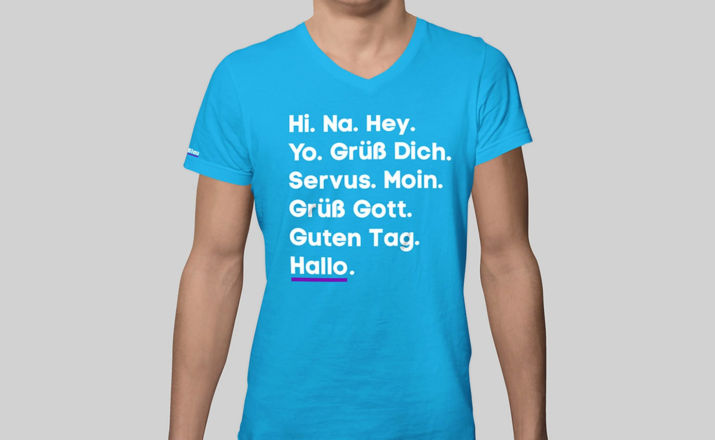
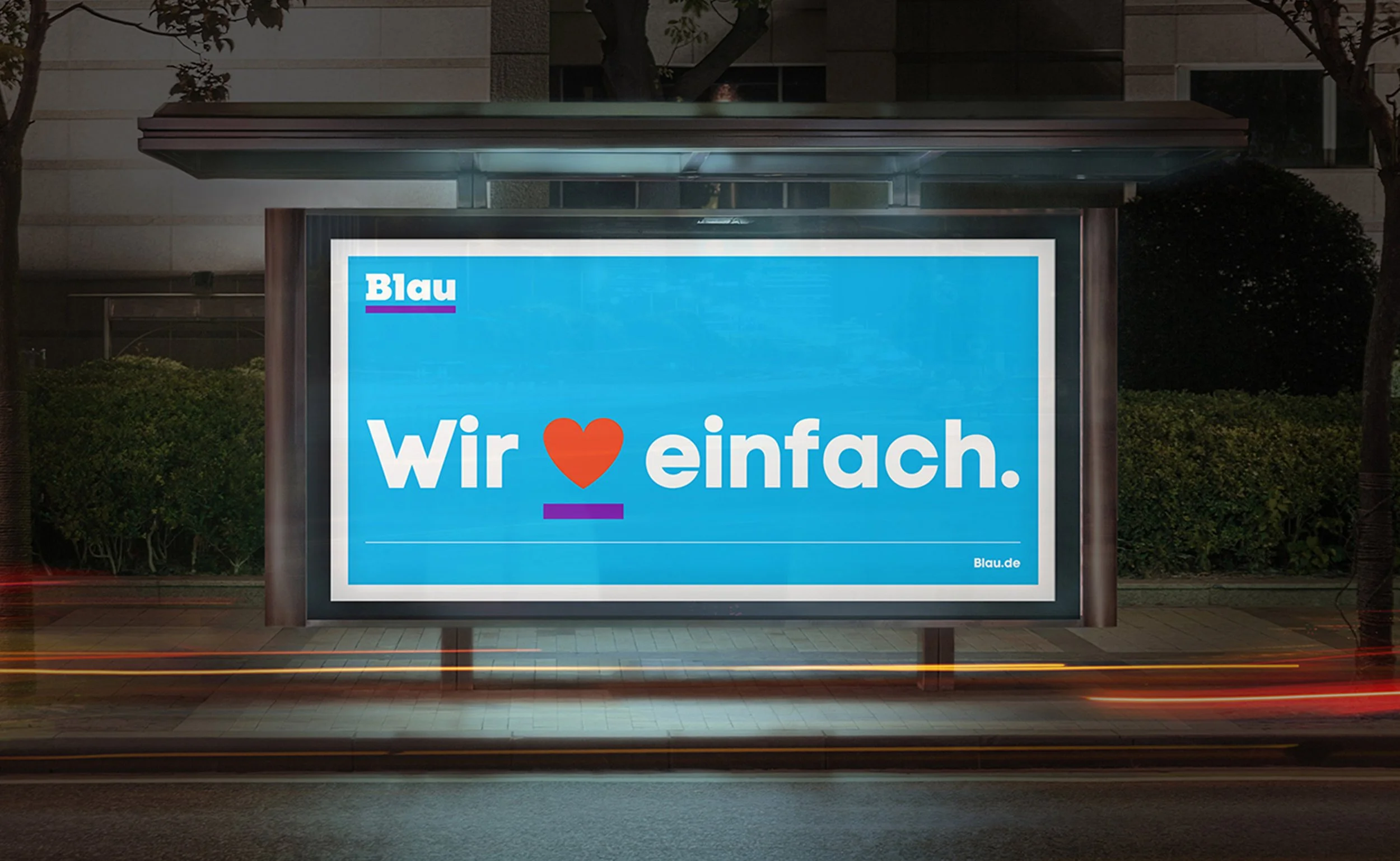
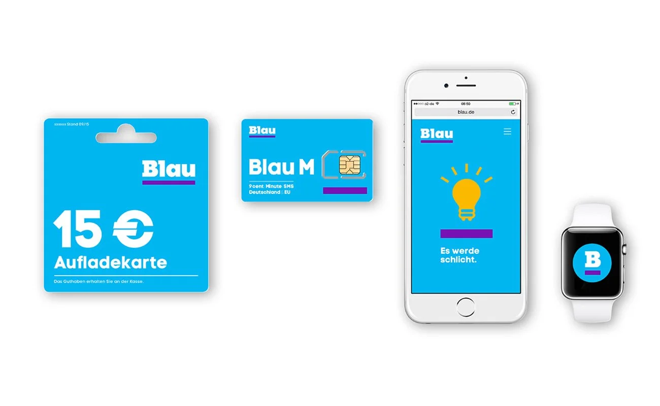
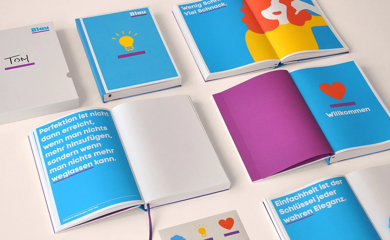
Blau cuts through the noise with a confident, no-frills approach. A bold logo and simple typography establish clarity, while a highlighter device draws attention to the essentials. Storytelling icons, witty messaging and custom illustrations give the brand a distinctive, engaging character.
Minimal yet expressive, the identity balances an unconventional attitude with warmth and charm.
Working with Superunion, we were responsible for design development, brand implementation and activation.